Thursday, 26 March 2015
Monday, 23 March 2015
Exporting the project
After we had finished the film it took a long time to export partly because of the MAC's being slow and also partly because of the opening credits
We had to keep rendering it before as well as it was starting to get very slow, and jumpy, while editing the credits this also took alot of time!


Once we finished we then had to export it which too ages and it even failed once and we had to start again, which took alot of time up but at least it was finished!!
yay!
We had to keep rendering it before as well as it was starting to get very slow, and jumpy, while editing the credits this also took alot of time!
Once we finished we then had to export it which too ages and it even failed once and we had to start again, which took alot of time up but at least it was finished!!
yay!
Thursday, 19 March 2015
The opening credits


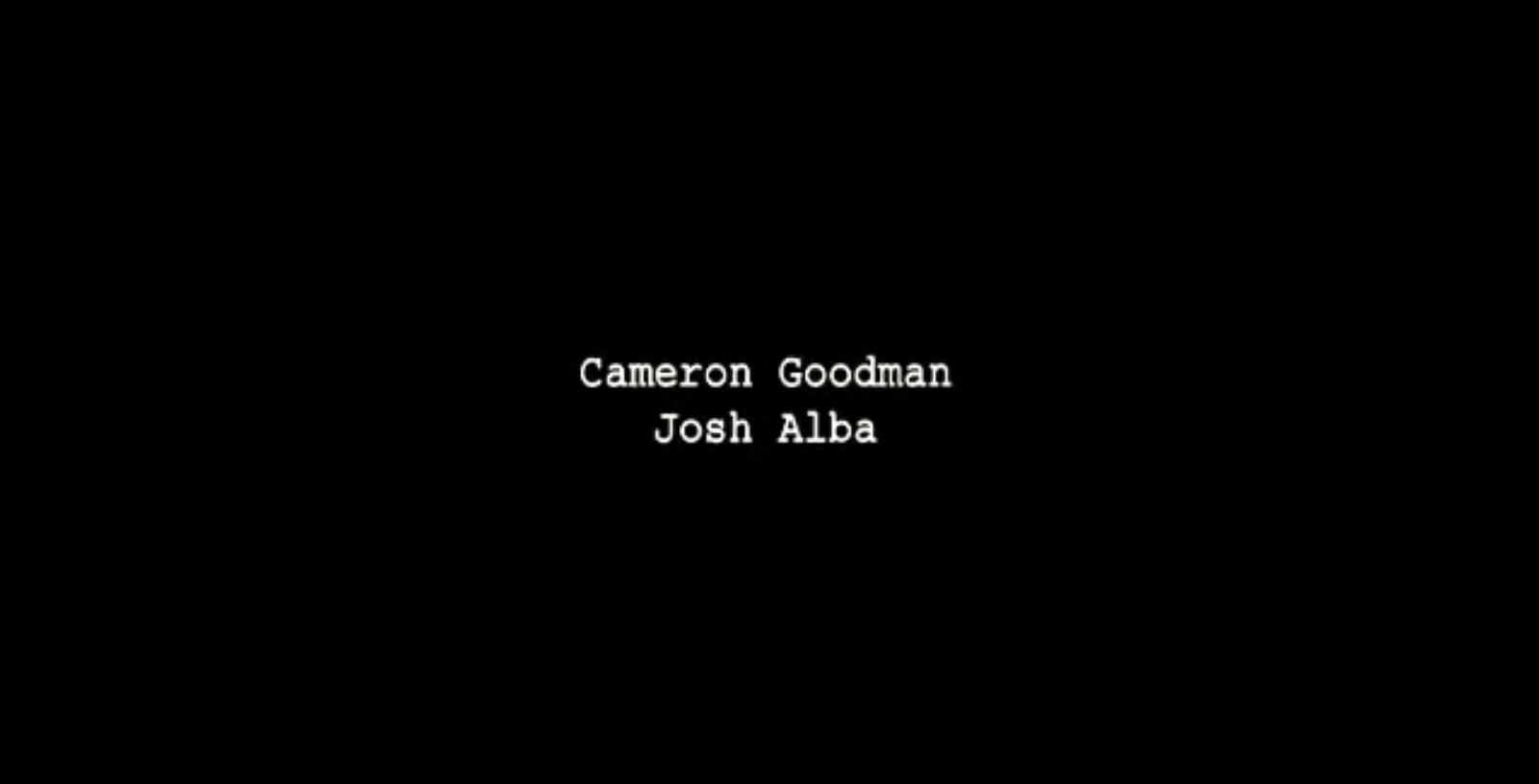

 This is the font and style we went for, the red sort of symbolizes a blood colour, showing the darkness of our film and trying to fit it mostly on a black background adds to the effect of it being dark genre.
Wednesday, 18 March 2015
Opening credits problem
Years before ours mostly used after effects program for their opening credits, unfortunately dues to the time we had at the end and other problems, when it came to the opening credits we had no idea how too use after effects, we tried to learn how to do it using teaching help and you tube videos in a quick lesson, but given it being a confusing program and the time we had it was much better for us to used premiere pro and infarct would work better as it will be effective simple titles, going along with our title theme, and the colour scheme will fit with our main title colour.
Opening credits - Progress
Our original plan with the credits was to export our film without the credits when we had finished it and then work on the PC's with premiere pro to add the credits in. That way we could use the faster computers and not have to worry about rendering too often and it was more reliable. But unfortunately we had exported our film in the wrong format, meaning that there was a large boarder around it and the quality was bad.
But with the time it took to export and the time it took to realize afterwards it was very frustrating and we lost some more time we could have used editing

 |
| Exporting with the wider view and better quality, took a lot longer to export |
Tuesday, 17 March 2015

Monday, 16 March 2015
Studios logo

We again decided to keep to the black and white dramatic theme, but still keep it animated using a cross fade with the stars the stars fading on from top to bottom, done on Photoshop and just using premiere pro to fade on photo without the stars into the photo with the stars.
At first we were going to use a brain instead of the moon, but though it would be too generic with the name "intelligence" as the studios name
We went with the night sky theme as it represents astronomy and intelligent subject and also studying astronomy mean looking out into the stars, outside the world, symbolizing that this studio thinks outside of the box.
New production company logo
We decided to change our main production company logo so it was animated at the beginning with the first three words coming up with typing sound affects and the keys popping up with a key sound effect (first three seconds of our film). We did this using Photoshop with the keys from a Google image, and premiere pro showing on photo after another and adding sound effects from you tube for the keys. We then exported the whole opening as its own video and put it at the beginning of our film.
We used the same font with the same colour, but we thought having it animated would be more realistic for a film production company, more interesting for the audience and show more of what the production company are about.
The keys meaning to represent unlocking to many more thing the company are capable of doing, but still keeping to the simple, older, more dramatic theme of film genres they would produce
Progress, The title

From inspiration from other zombie horror films


Sunday, 15 March 2015
Editing - The weird clip
Editing on the MAC's cause some problems, little details which we would have to either sort out or re- do
For example one of our clips loosing its boarder and zooming in
 This clip when playing was zoomed in and cut off some off the bottom. Even when we put it back into the editing side, it said it was normal although it wasn't. This is an example of little things that would go wrong which would take time to sort out. We ended up having to re-upload this clip to the computer then put it back onto premiere pro for it to work which was okay!!
For example one of our clips loosing its boarder and zooming in
Friday, 13 March 2015
Progres - THE GREAT DELETION OF 2015.
After a two hour stint of editing, we closed the project ready to log out and go to break. When we opened our project again, the work space was gone. I don't mean the clips were gone I mean THE ENTIRE WORK SPACE WAS GONE AND HAD TAKEN THE CLIPS WITH IT. Obviously we were more than a little bit gutted, our entire project was gone. We managed to salvage what we could from an auto save, but this meant that we lost the whole two hours of hardcore editing, slowing us down quite a bit close to the deadline!!
Thursday, 12 March 2015
Editing issues - Problems with the MAC's
Because we made the sound for our opening sequence before we'd even filmed it, editing was less of an issue for us than other groups. Where others had to fit music around a scene with dialogue as a source of plot points, we only had to fit imagery to the sounds we'd created beforehand.
With our experience of continuity editing, we set to work trying to piece together our project. We hit a few snags along the way.
1. The computers in the different media rooms were not compatible with each other. When we tried to take our files from the macs to the PC's, they system got confused and couldn't find any of the media. This meant that we could only edit in the mac suite, cutting into the amount of lesson time we could spend editing.
2. Rendering. In the beginning, files took about 20 minutes at a time to render, This was to do with the MAC's being slower computers than the PC's in the other room, but because of the problem we mentioned before we could not use the PC's and had to deal with the MAC's. We later learnt that if we rendered every five minutes or so then the process was much shorter.

3. Certain files were only available on one mac. This meant that we could only edit our film on one specific computer.

With our experience of continuity editing, we set to work trying to piece together our project. We hit a few snags along the way.
1. The computers in the different media rooms were not compatible with each other. When we tried to take our files from the macs to the PC's, they system got confused and couldn't find any of the media. This meant that we could only edit in the mac suite, cutting into the amount of lesson time we could spend editing.
2. Rendering. In the beginning, files took about 20 minutes at a time to render, This was to do with the MAC's being slower computers than the PC's in the other room, but because of the problem we mentioned before we could not use the PC's and had to deal with the MAC's. We later learnt that if we rendered every five minutes or so then the process was much shorter.
3. Certain files were only available on one mac. This meant that we could only edit our film on one specific computer.
Friday, 6 March 2015
Editing progress
Editing is going really well. We've made the first minute or so in the project and it fits in really well with the music we've made for it.

Subscribe to:
Posts (Atom)