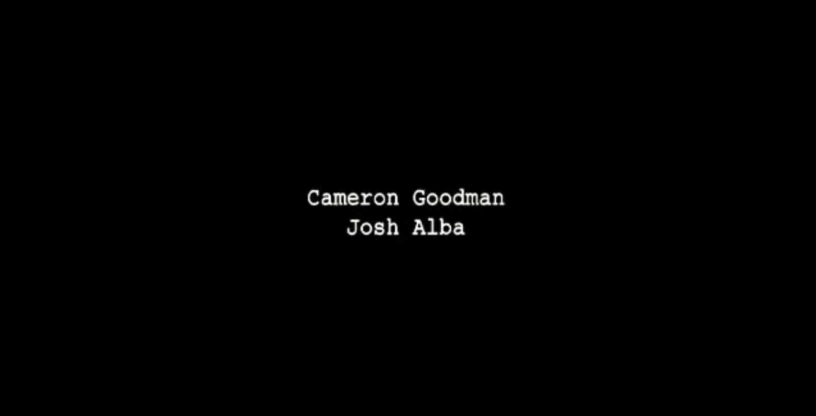
We went with simple credits them went with our colour scheme for the main title. We added the credits on premiere pro using their program. This was much more time effective then using after effects, and in the end we think it worked out much better as using flashy animations and font types wouldn't have been fit in our genre, we learnt this from out research.

Title sequences from other films in our genre also has simple colour schemes and font so we thought it was best fit for our film too

This is the font and style we went for, the red sort of symbolizes a blood colour, showing the darkness of our film and trying to fit it mostly on a black background adds to the effect of it being dark genre.


No comments:
Post a Comment